The Truth about DPI & PPI
For clarity all units-of-measurement will be hyphenated and italicized and all specific terminology will be in bold.
PPI vs DPI:
Web pages have no physical dimensions (that’s why they can be displayed on an iPhone or from a projector). Because of this, anything measured in inches is meaningless. Pixels-per-inch (PPI) and dots-per-inch (DPI) are both hardware and printing related terms.
DPI has to do with the resolution of a printed image (or word). It’s literally how many dots of ink are printed on a piece of paper for every inch. The DPI can be different from the PPI as I’ll explain in a bit. Unfortunately, it has been so commonly misused when PPI was the appropriate term, that it has become convention.
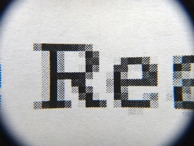
PPI has two different meanings, one related to hardware (displays in specific) and one related to printing. When it comes to printing, PPI is then number of image pixels printed per inch of paper. For example, if you have a 300 x 300 pixel image and print it at 30 PPI it will be a 10 inch square with 30 pixels across each inch. This differs from DPI because the printer could use more than 30 dots of ink/toner per inch. You can see the difference between a printed dot and a printed pixel in the image below. If you look at the top left corner of the R, you can clearly see an approximately 18 dot square. That square is only 1 pixel despite being made up of about 18 dots (which, confusingly, is about 3 dots-per-pixel, which isn’t a form of measurement I’ve ever encoutered before).
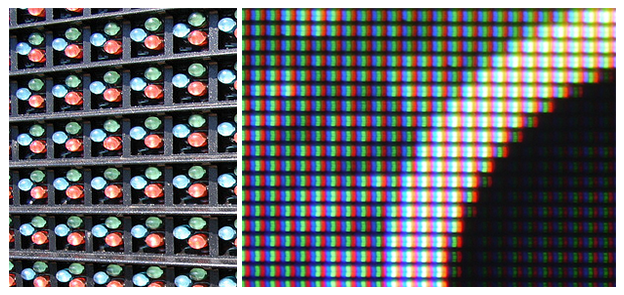
For hardware, on the other hand, a pixel is exactly what you’d expect it to be: one RGB square of light.
In fact, pixels are actually made up of “sub-pixels” — red, green and blue light elements that the human eye cannot see because additive color processing blends them into a single hue which appears on the pixel level.
The PPI of a display is the number of these pixels for every inch of the display and cannot change once the device has been built. For reference, the iPhone 6s display is 1334 x 750 pixels at 326 PPI, meaning it’s screen size is about 4.09 x 2.3 in.
Resizing vs. Resampling:
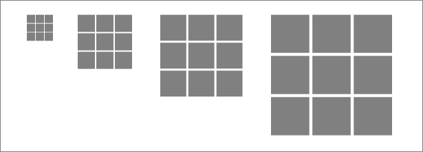
Whenever you change the PPI (or DPI as some image editing programs would have you believe) you are resizing an image. This is illustrated below. Resizing an image doesn’t affect the way it appears on web pages because web pages don’t have physical measurements (they’re measured only in pixels). Sometimes, however, web pages will have to do the resizing an image for you in order for it to fit on a page the way it’s supposed to. This is a change to the PPI of the image and is dependent on the display. This is done by the browser and the image properties are unrelated. Note that it is impossible to resize an image to smaller than 1 image-pixel (CSS-pixel) to 1 actual-pixel (device-pixel). More on different types of pixels later.
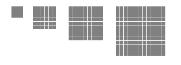
Resampling, however, is what is important for us when creating images for the web (usually scaling them down so as to reduce web page loading times). The way this works when reducing the resolution (the size in pixels, e.g. 300 pixels by 300 pixels) of an image is the software will take out some of the pixels (every other pixel for example) and then average them out in the pixels that are left over. When increasing the resolution of an image, the software will make guesses as to what color the pixels it inserts should be (again, every other pixel for example). This is illustrated below. Note that this is technically what is being done when you resize an image to enlarge it or zoom in/out on your display. The inserted pixels are just always the same color as the adjacent pixels, resulting in there appearing to be larger pixels. When zooming out in your display, resampling is done as well, because, as mentioned before, you can’t resize an image to smaller than 1 image-pixel to 1 actual-pixel.
Types of Pixels and Why They Matter:
When loading a web page, the browser first compares the number of CSS-pixels vs actual-pixels (device-pixels). This is called the pixel-ratio (or device-pixel-ratio) and for most displays, there’s an approximate 1:1 correlation. However, on some displays (retina for example) there can be a 2 or higher pixel-ratio. More about pixel-ratios later. When we insert an image into the web page, we tell it how many CSS-pixels it should take up. The browser will then resample to display the image smaller than it’s original resolution or resize the image to display it larger (it never resamples to enlarge images). In either case, the original image still has to be loaded. That’s why the resolution should be as close as possible to the CSS-pixel resolution (i.e. the size in CSS-pixels that we want the image to be) when uploading an image. If it isn’t, than either an unnecessarily large image file will be loaded for the web page, or the image will be resized, effectively reducing the PPI and the quality of the image.
The reason it’s important to know whether a display has a pixel-ratio greater than 1 is so that we can take advantage of that to help our images look better. Normally, the way that those displays need to interpret web pages is as follows for a pixel-ratio of 2:
This resizes the images and text on a page to keep it from looking too small. Here is an example of what it looks like when this doesn’t happen (this may look familiar to some of you):
And here is an example of what it looks like when it does:
The difference and usefulness should be clear. However, since we can control which images are displayed based on the pixel-ratio of a display, we can mimic a “perfect” resampling to enlarge the image resolution instead of just resizing. When we tell it to use an image that is twice the resolution (which we upload as a separate file) we also tell it to display that image at a 1:1 pixel-ratio so that it takes up the same number of device-pixels.